Exciting news from YouTube: they’re rolling out a game-changing feature that will make your life as a YouTube creator a lot easier. Get ready to optimize your thumbnails like a pro with the new Thumbnail Test & Compare tool, which is rolling out to creators gradually over the next few months.
What’s the Deal with Thumbnail Test & Compare?
Thumbnails are your video’s first impression, your chance to grab eyeballs and get clicks. Up until now, swapping out thumbnails to see what works best has been a manual process.
Fortunately, YouTube just launched the Thumbnail Test & Compare tool to minimize the hassle. This tool lets you upload multiple thumbnails for a new video and tests them “evenly” across your viewers. This means each of your thumbnails will be shown to different users, and YouTube will give you the lowdown on which one pulls in more viewers and keeps them watching longer.
Here’s how it works: YouTube will show your thumbnails to your audience, analyze the performance, and pick a winner based on which one generates the most watch time. If the results are clear, you’ll have a winner. If it’s a close call, YouTube will recommend a “Preferred” choice. And if it’s neck-and-neck, you can choose to keep things as they are or go with the suggested pick.
Best Practices for YouTube Thumbnails
As you check out the Thumbnail Test & Compare tool, let’s also make sure your thumbnail options are on point. Here are our top tips for creating killer thumbnails:
- High-Quality Images: Keep it crisp and clear. Blurry thumbnails are a no-go.
- Accurate Representation: Don’t mislead – make sure your thumbnail represents your video accurately.
- Eye-Catching Colors: Use bold, bright colors to stand out in the feed. And don’t be afraid of white space – it can help to make your image feel less cluttered.
- Use Compelling, Readable Text: Add a quick description to your thumbnail to tease what the video covers. Big, clear text is key – and make sure it’s easy to read on any device.
- Close-Up Faces: Expressive faces can draw viewers in. Show some emotion!
- Consistency: Stick to a consistent style with colors and fonts so your audience can easily recognize your content.
- Contrast and Brightness: Boost contrast and brightness to make your thumbnail pop.
- Action Shots: Use energetic, action-packed shots from your video to grab attention.
Examples of Effective YouTube Thumbnails
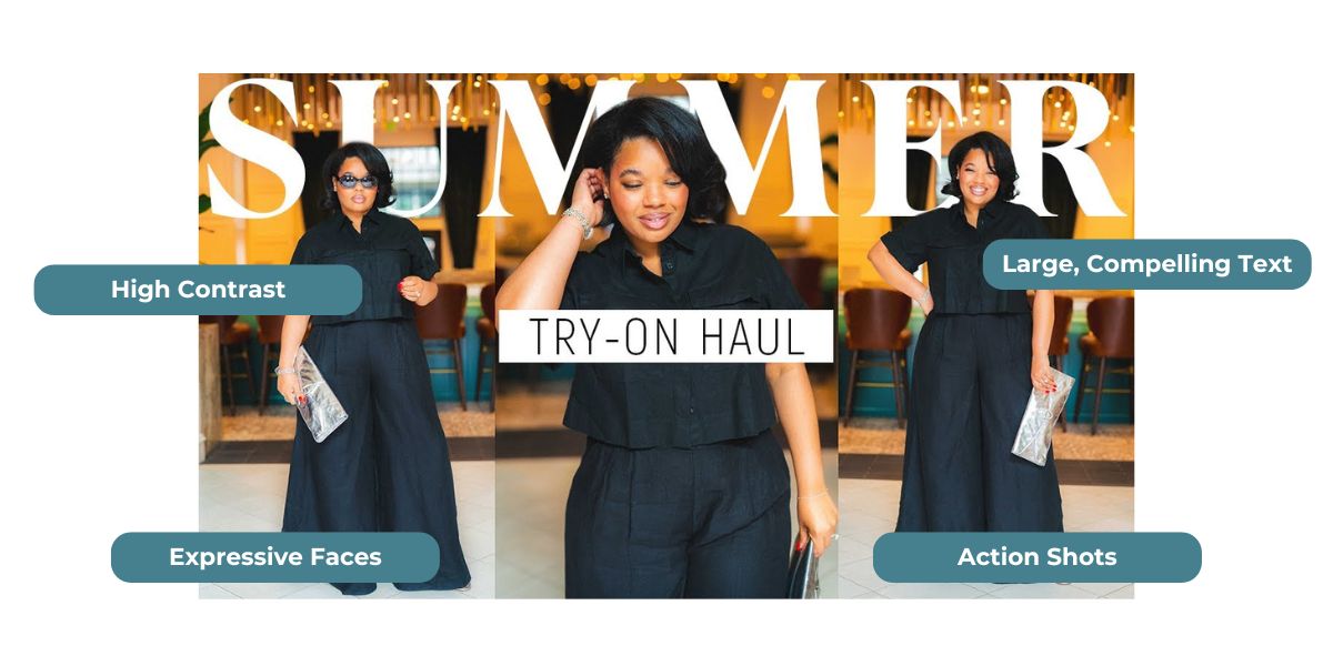
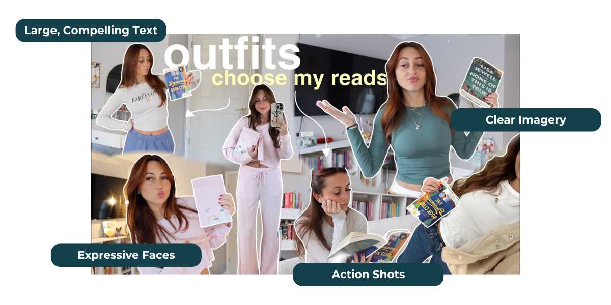
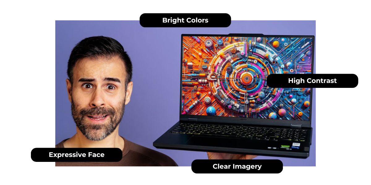
Embrace the Change with Thumbnail Testing
YouTube’s Thumbnail Test & Compare feature takes the guesswork out of thumbnails for your videos. Use it to make data-driven decisions and find out what resonates with your audience. Paired with knowledge of thumbnail best practices, your video has a better chance of standing out in viewers’ feeds which means you have more opportunities to grow your YouTube following.
Apply to join the MagicLinks Creator network to gain access to all of our creator resources and brand partnership opportunities!


